
MYRRORS Brand Identity and App UX/UI Development
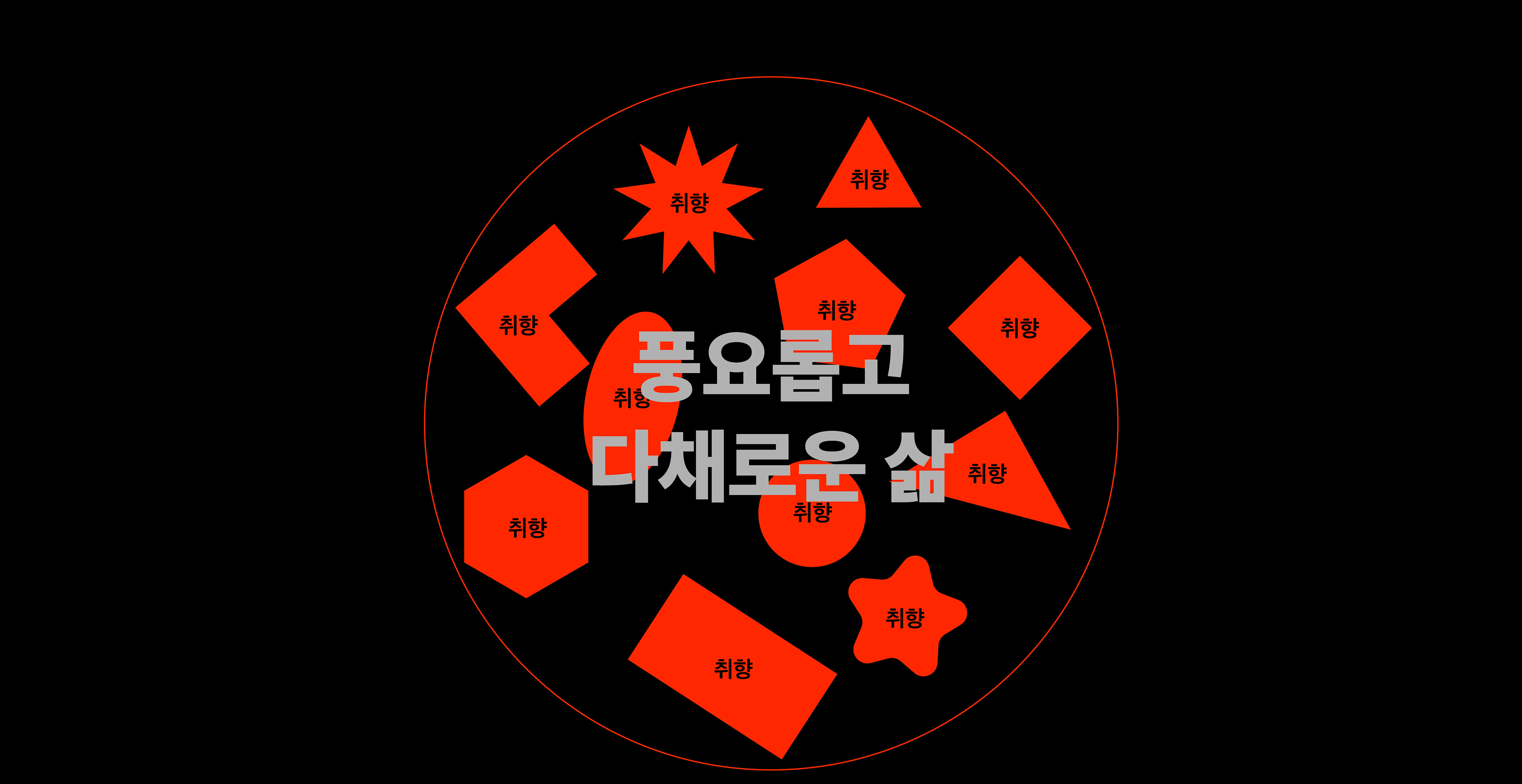
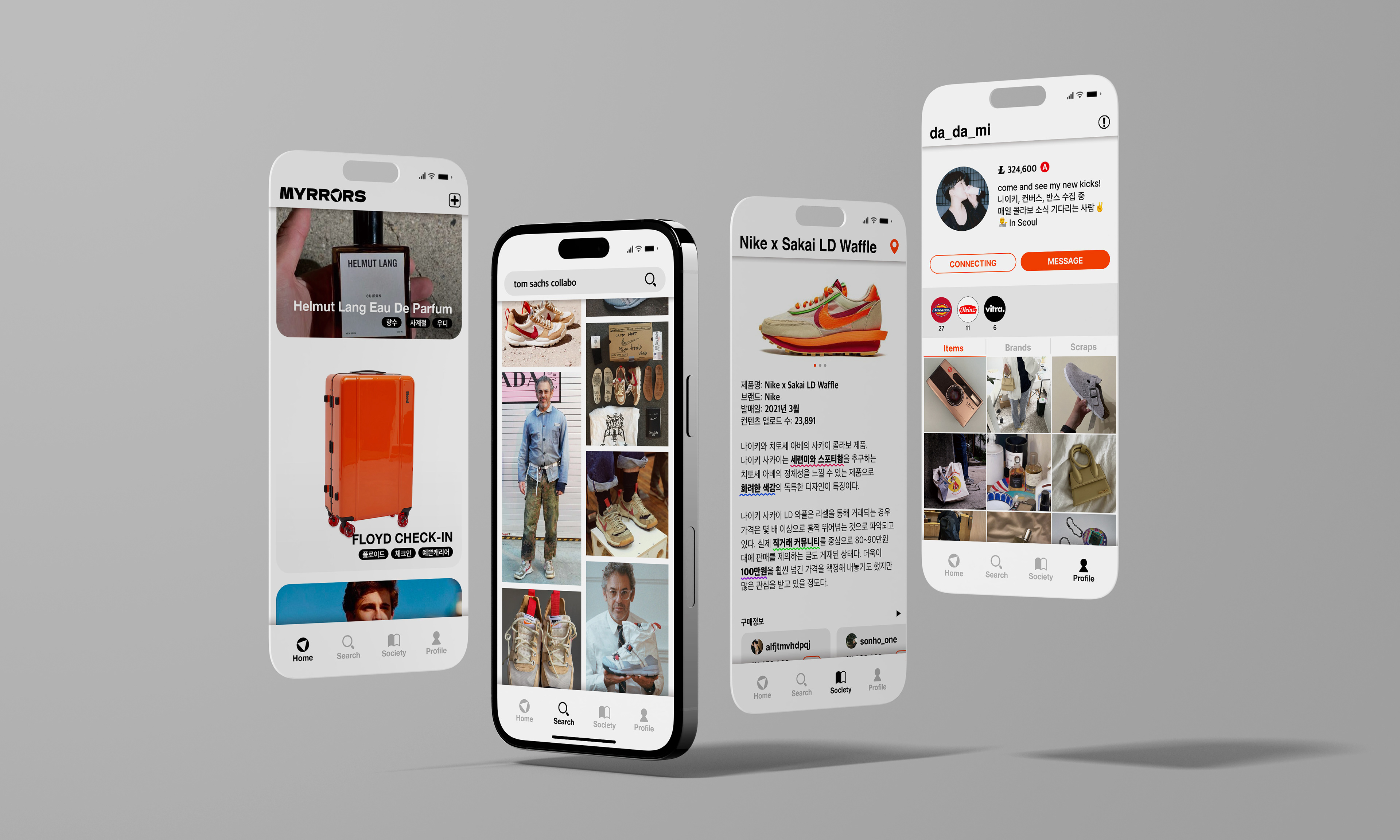
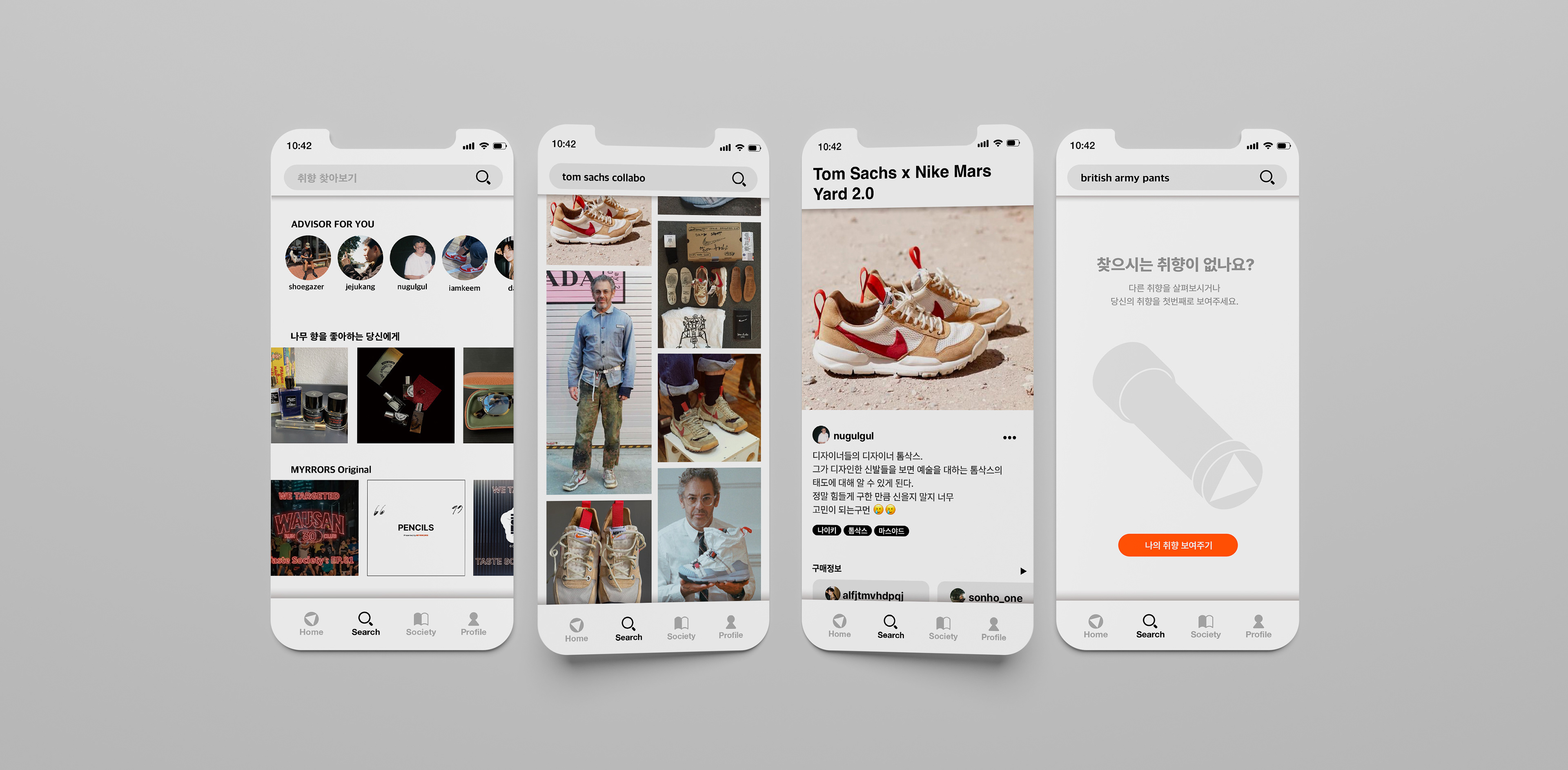
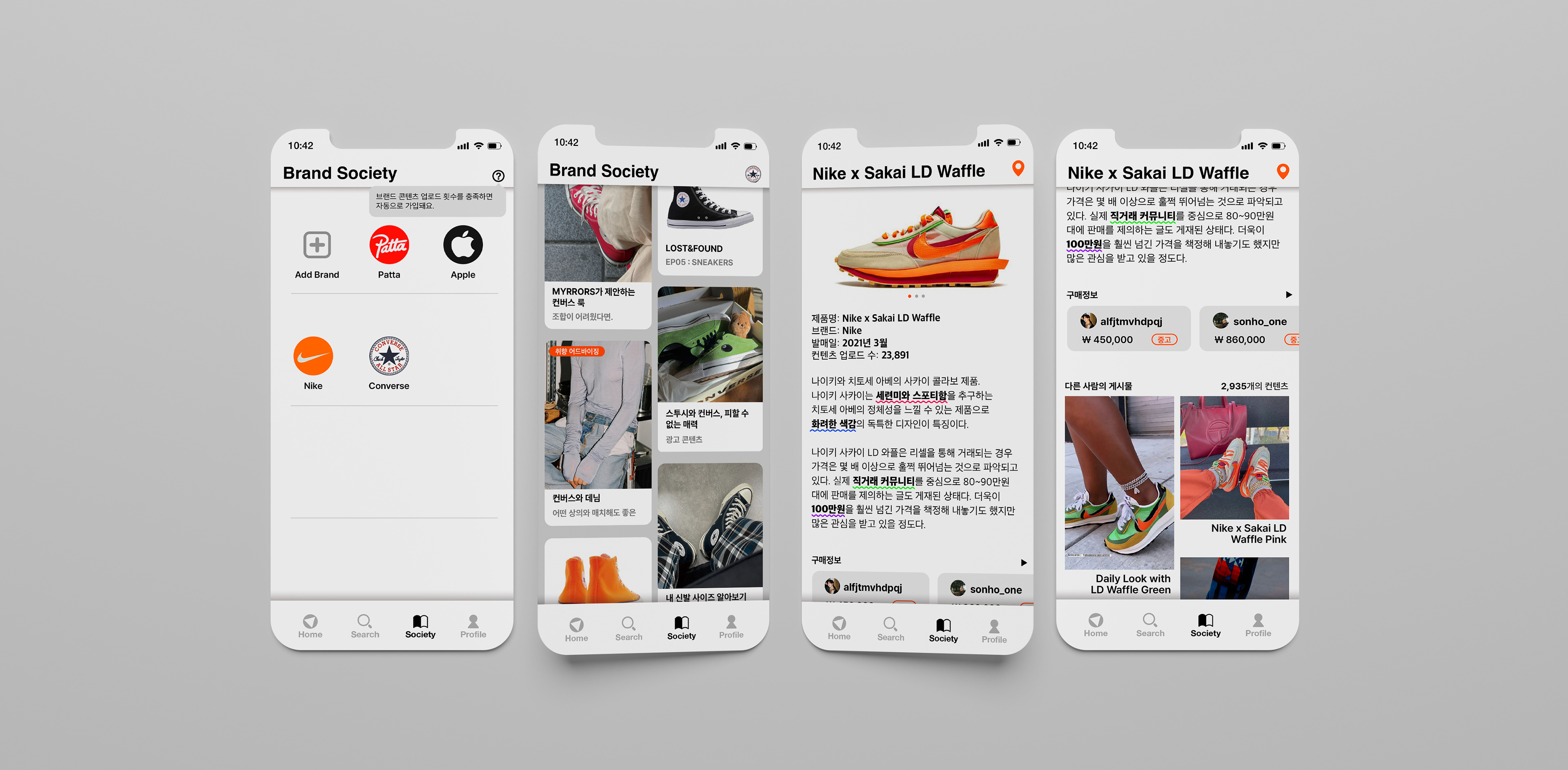
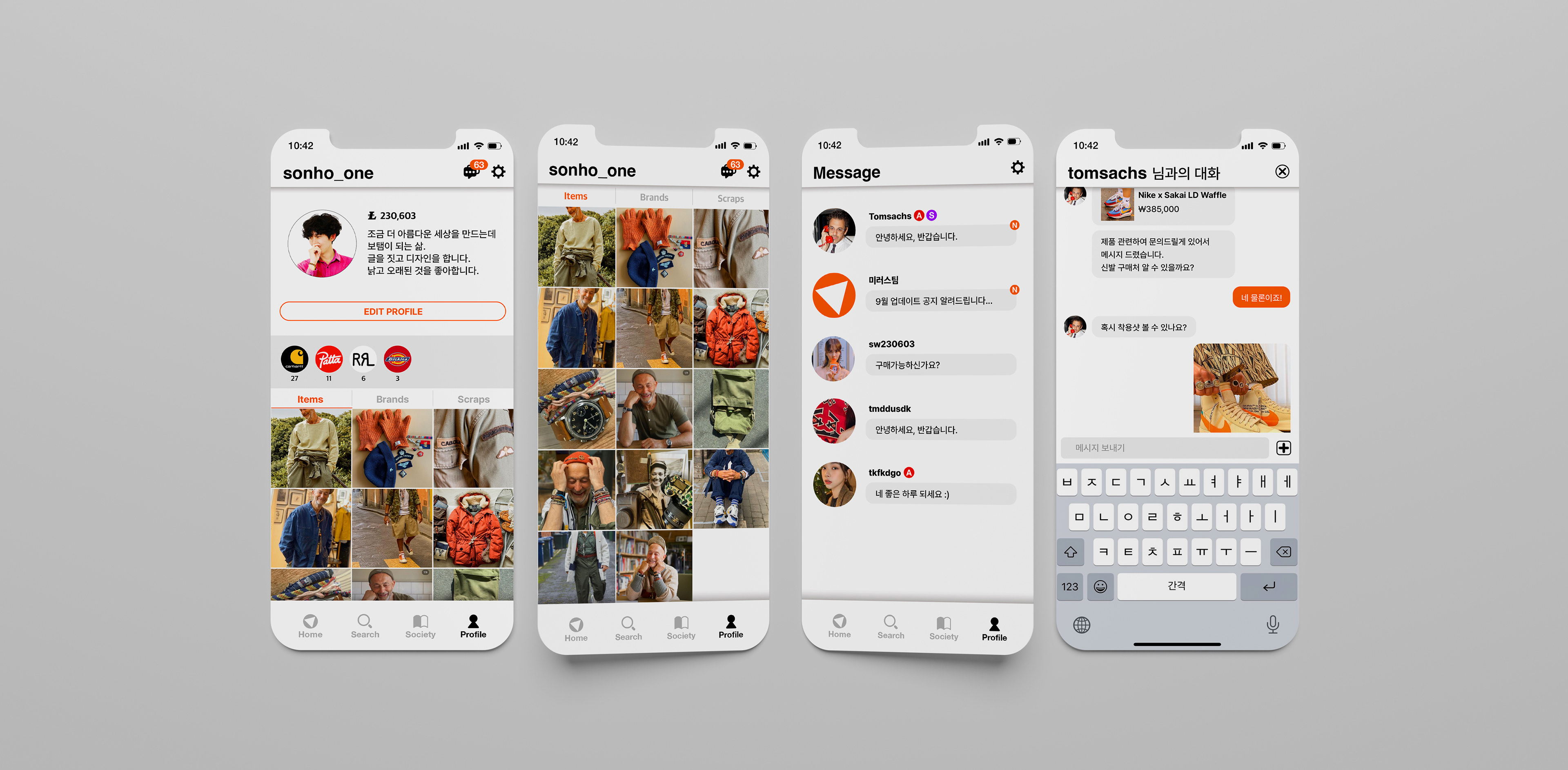
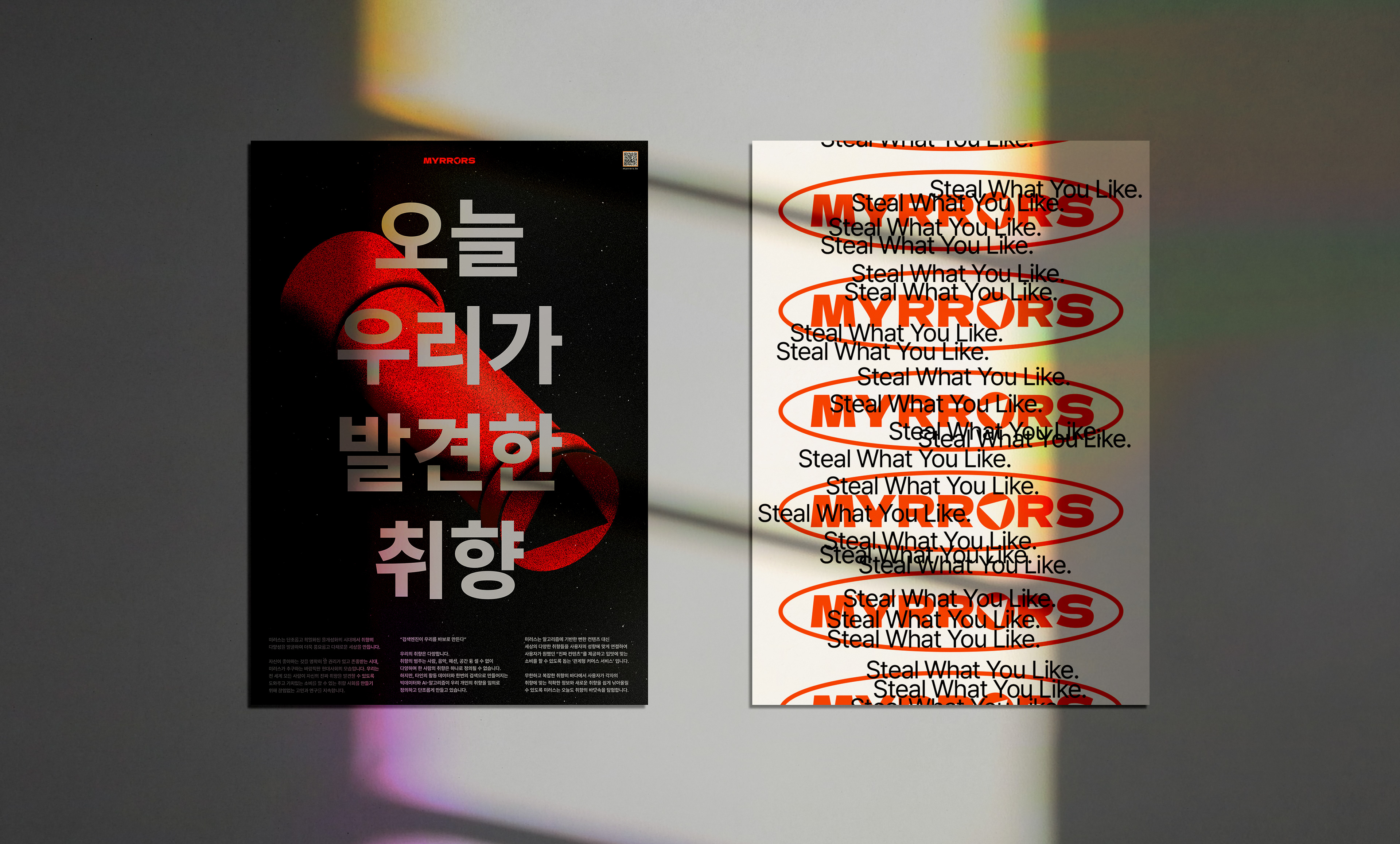
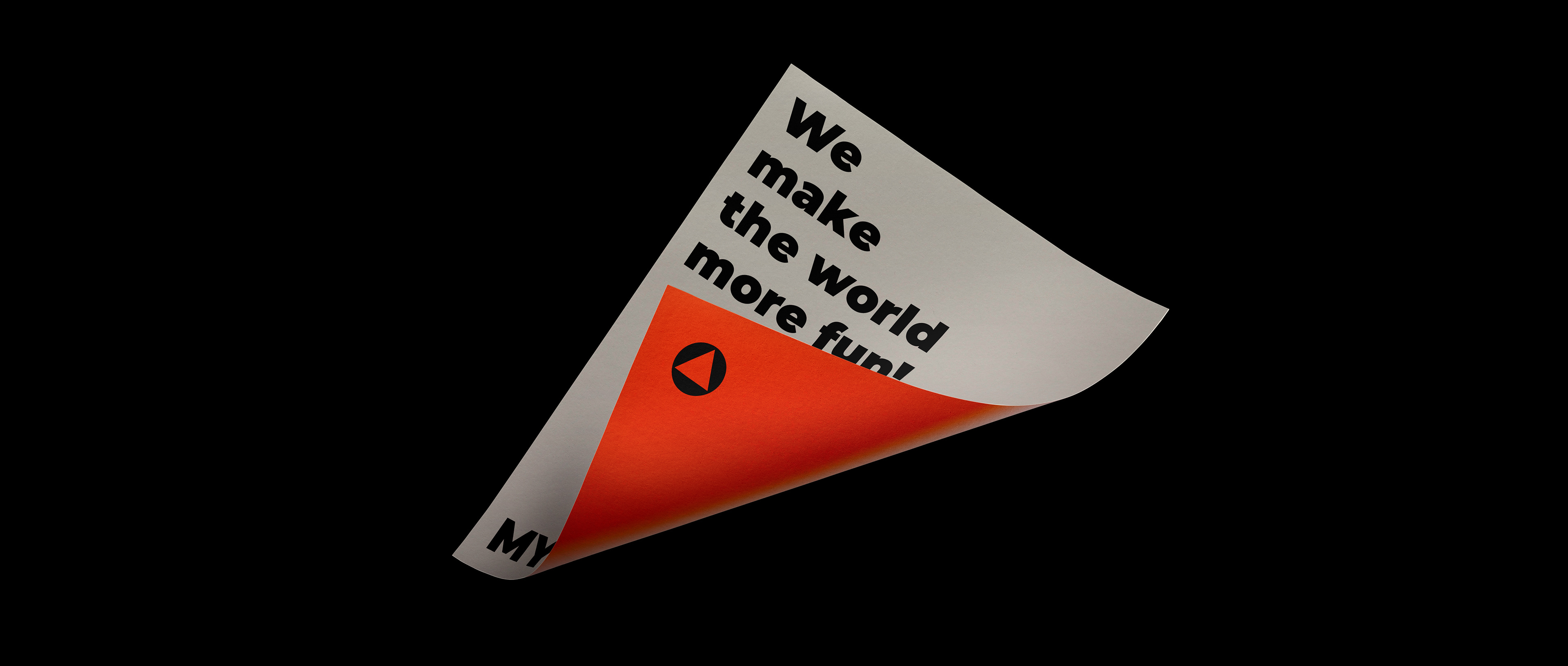
MYRRORS is a relational commerce service that connects the various tastes of the world to suit the user's preference, instead of the obvious algorithm-based content, provides the 'real content' that the user wants and helps them to consume according to their taste. MYRRORS creates a richer and more colorful world by discovering the diversity of taste in the monotonous and standardized era of deindividuation.
MYRRORS explores the sea of tastes today so that users can easily find accurate information and new tastes that suit their tastes in the infinite and complex sea of tastes.
미러스는 알고리즘에 기반한 뻔한 컨텐츠 대신 세상의 다양한 취향들을 사용자의 성향에 맞게 연결하여 사용자가 원했던 ‘진짜 컨텐츠’를 제공하고 입맛에 맞는 소비를 할 수 있도록 돕는 관계형 커머스 서비스 입니다. 미러스는 단조롭고 획일화된 몰개성화의 시대에서 취향의 다양성을 발굴하여 더욱 풍요롭고 다채로운 세상을 만듭니다.
무한하고 복잡한 취향의 바다에서 사용자가 각자의 취향에 맞는 적확한 정보와 새로운 취향을 쉽게 낚아올릴 수 있도록 MYRRORS는 오늘도 취향의 바닷속을 탐험합니다.

“Search engines make us stupid”
Our tastes are diverse.
There are countless categories of tastes, such as people, music, fashion, and space, and one person's taste cannot be defined as one. However, big data and AI-algorithms created from other people's activity data and one-time search arbitrarily define and monotonize our individual tastes.
There are countless categories of tastes, such as people, music, fashion, and space, and one person's taste cannot be defined as one. However, big data and AI-algorithms created from other people's activity data and one-time search arbitrarily define and monotonize our individual tastes.
“검색엔진이 우리를 바보로 만든다”
우리의 취향은 다양합니다.
취향의 범주는 사람, 음악, 패션, 공간 등 셀 수 없이 다양하며 한 사람의 취향은 하나로 정의될 수 없습니다. 하지만 타인의 활동 데이터와 한번의 검색으로 만들어지는 빅데이터와 AI-알고리즘이 우리 개인의 취향을 임의로 정의하고 단조롭게 만들고 있습니다.
취향의 범주는 사람, 음악, 패션, 공간 등 셀 수 없이 다양하며 한 사람의 취향은 하나로 정의될 수 없습니다. 하지만 타인의 활동 데이터와 한번의 검색으로 만들어지는 빅데이터와 AI-알고리즘이 우리 개인의 취향을 임의로 정의하고 단조롭게 만들고 있습니다.
This is a desirable modern society that MYRRORS pursues, an era in which people have the right to know what they like and are respected. We continue to research and contemplate to create a taste society where everyone around the world can discover their true taste and value consumption.
자신이 좋아하는 것을 명확히 알 권리가 있고 존중받는 시대, 미러스가 추구하는 바람직한 현대사회의 모습입니다.
우리는 전 세계 모든 사람이 자신의 진짜 취향을 발견할 수 있도록 도와주고 가치있는 소비를 할 수 있는 취향 사회를 만들기 위해 끊임없는 고민과 연구를 지속합니다.
우리는 전 세계 모든 사람이 자신의 진짜 취향을 발견할 수 있도록 도와주고 가치있는 소비를 할 수 있는 취향 사회를 만들기 위해 끊임없는 고민과 연구를 지속합니다.
Mirrors; 거울
An object that reflects the shape of an object using the reflection of light.
A word used figuratively to reveal or show something as it is.
Something that serves as an example or a lesson.
A word used figuratively to reveal or show something as it is.
Something that serves as an example or a lesson.
빛의 반사를 이용하여 물체의 모양을 비추어 보는 물건.
어떤 사실을 그대로 드러내거나 보여 주는 것을 비유적으로 이르는 말.
모범이나 교훈이 될 만한 것.
어떤 사실을 그대로 드러내거나 보여 주는 것을 비유적으로 이르는 말.
모범이나 교훈이 될 만한 것.
Kaleidoscope; 만화경[萬華鏡]
It is a device designed to see beautiful patterns by inserting a three-sided mirror in a cylinder and inserting colorful glass beads and pieces of paper. When the cylinder is turned round and round while looking inside through the hole, various patterns change due to the reflection, revealing many images and various beautiful shapes. It is called a kaleidoscope because the same pattern does not appear again and new patterns continue to appear.
원통 속에 3면으로 이루어진 거울이 들어가 있고, 형형색색의 유리구슬과 종이조각 등을 넣어 아름다운 무늬를 볼 수 있도록 고안된 장치이다. 구멍으로 내부를 들여다보면서 원통을 빙글빙글 돌리면, 반사에 의해 다양한 무늬가 변화하며 많은 상과 갖가지 아름다운 모양을 나타낸다. 같은 모양은 다시 나타나지 않고 새로운 무늬가 계속 나타나기 때문에 천변만화(千變萬化)하는 거울이라 하여 만화경이라고 한다.
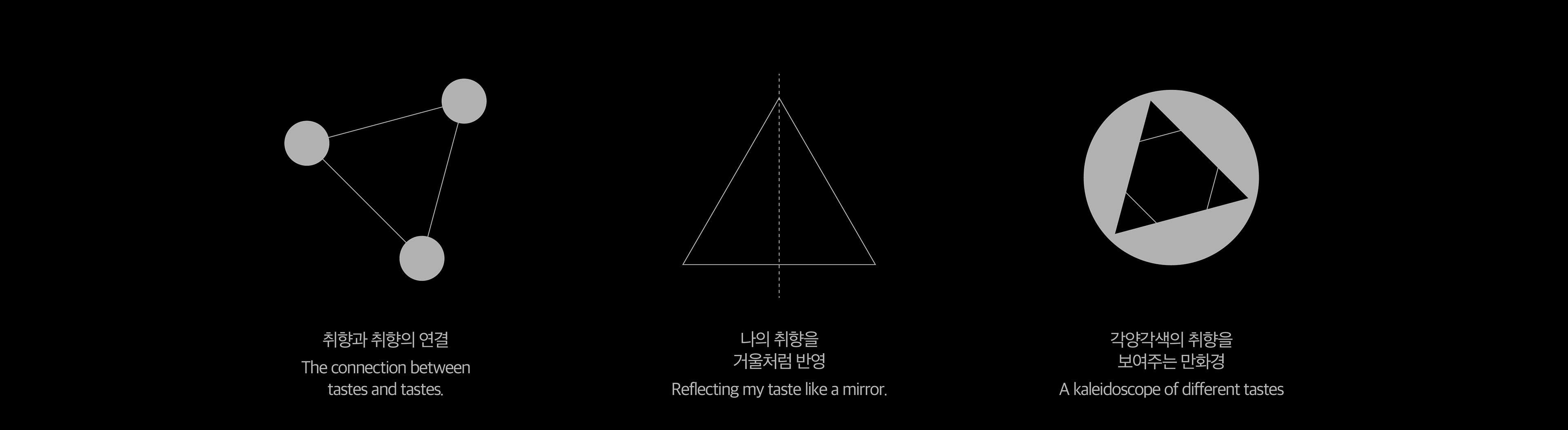
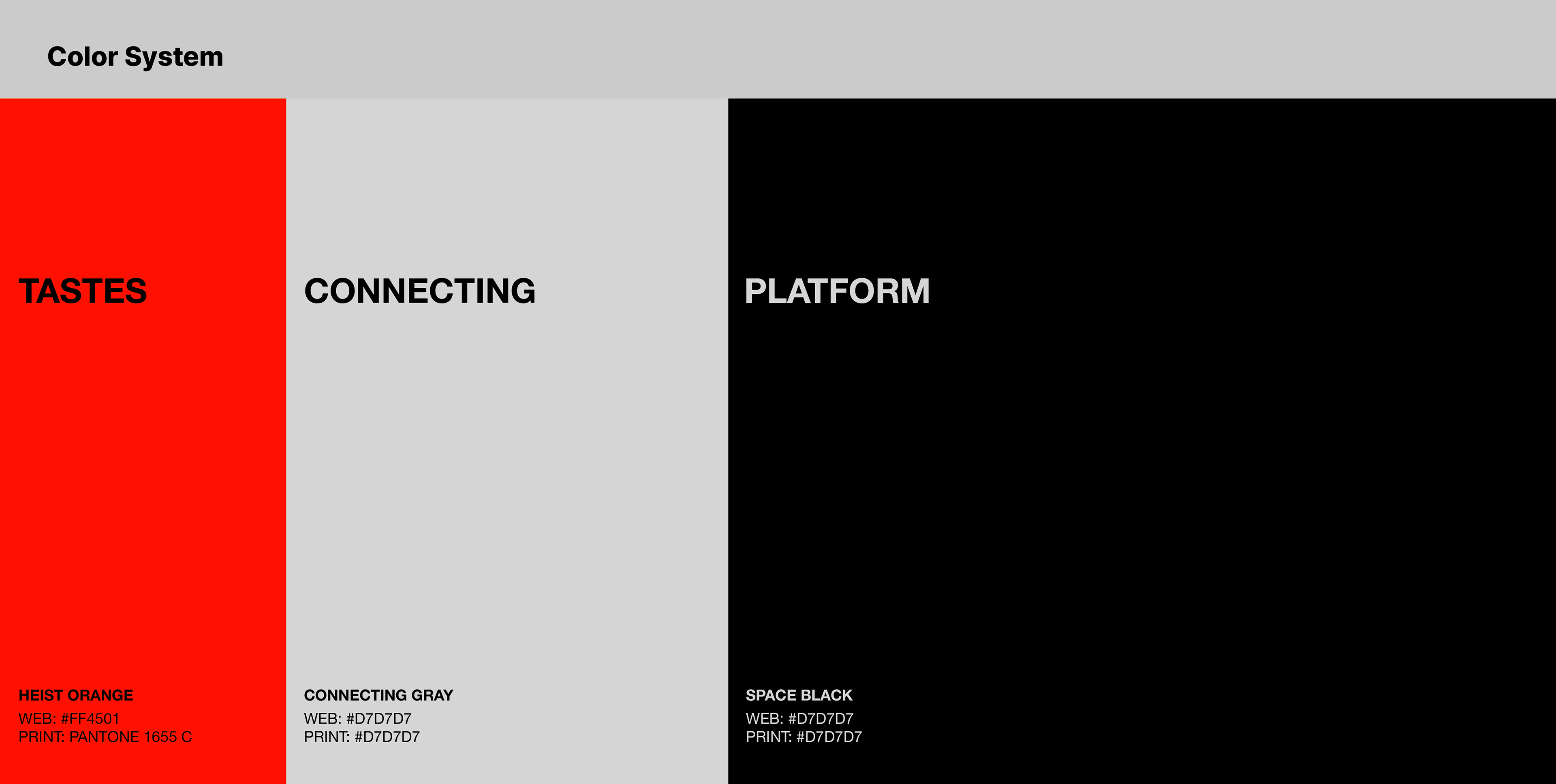
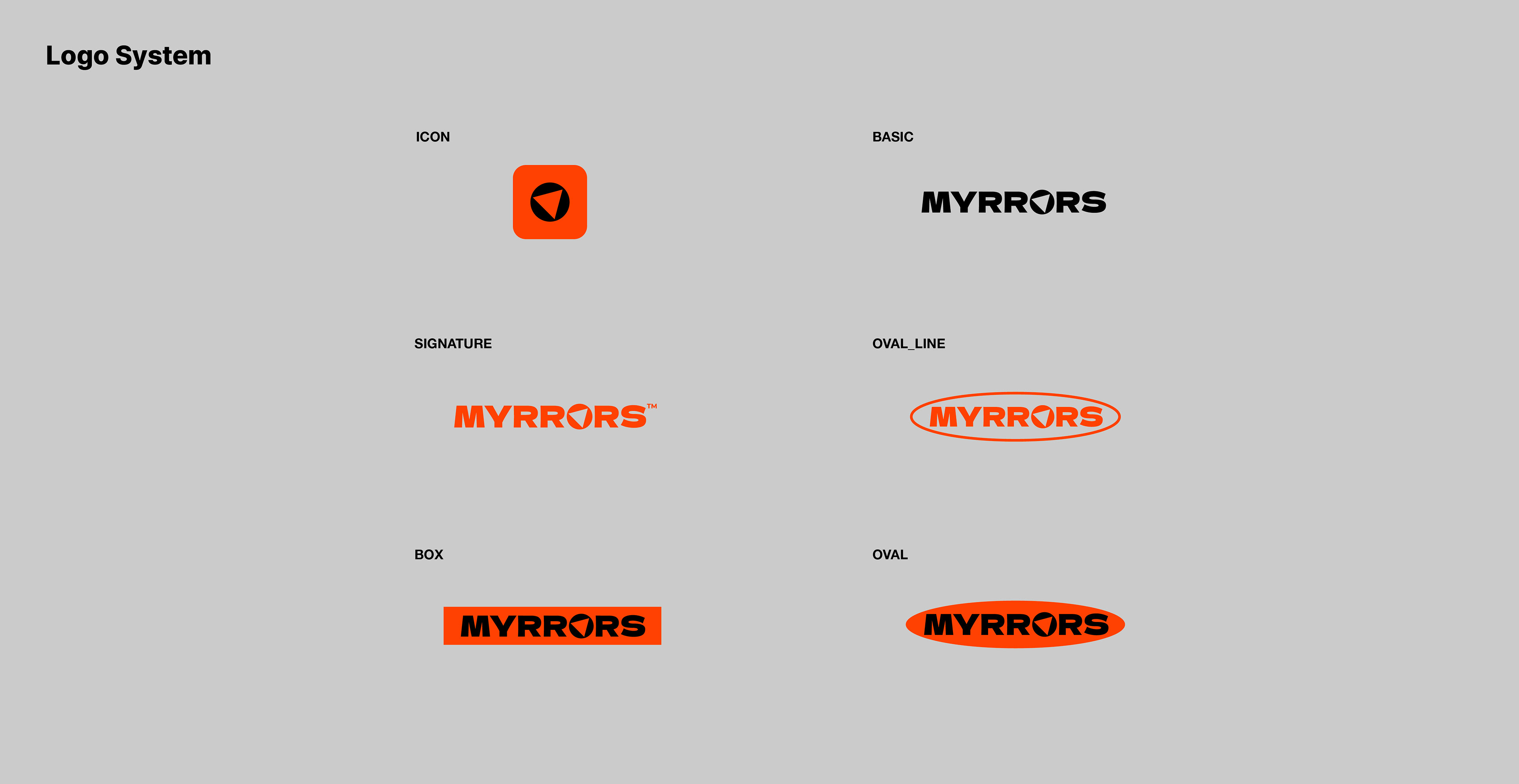
Myrrors is a combination of My and Mirrors, and means a mirror that reflects the various tastes that you and others have. The brand name and logo, Myrrors, were created with a motif from a mirror that reflects my tastes and connects them to the tastes of others, and a kaleidoscope that finds and shows new tastes.
Myrrors는 My와 Mirrors를 합친 단어로, 나와 타인이 가지고 있는 다양한 형태의 취향을 비추는 거울이란 의미를 가지고 있습니다. 나의 취향을 투영하고 다른 사람의 취향을 연결하여 비춰주는 거울, 그리고 새로운 취향을 찾아 보여주는 만화경에서 모티브를 얻어 Myrrors라는 브랜드 네임과 로고가 탄생했습니다.

The Kaleidoscope is the most basic symbol of Myrrors. Designed with the inspiration of a kaleidoscope that shows tens of thousands of shapes, it means a mirror that shows various tastes, that is, Myrrors service.
만화경은 미러스를 상징하는 가장 기본적인 심볼입니다. 수만가지의 모양을 보여주는 만화경에서 영감을 받아 디자인되었으며 다양한 취향을 보여주는 거울, 즉 미러스 서비스를 의미합니다.

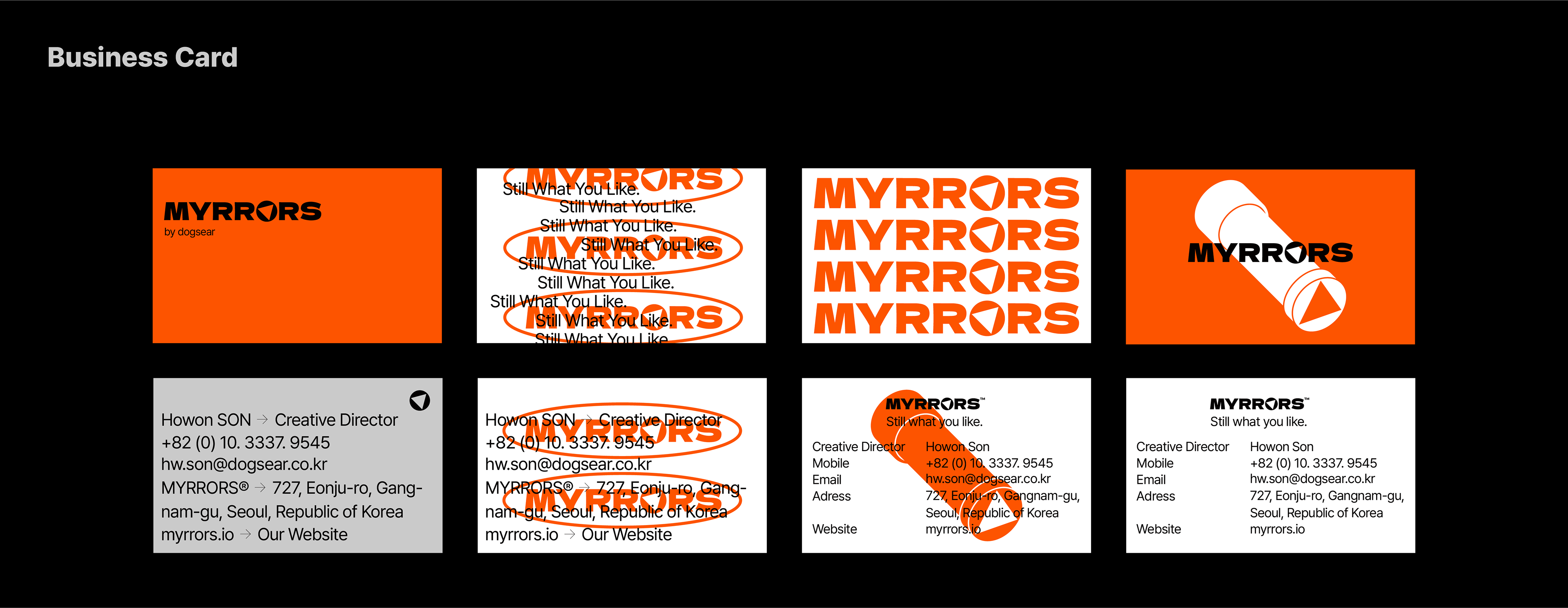
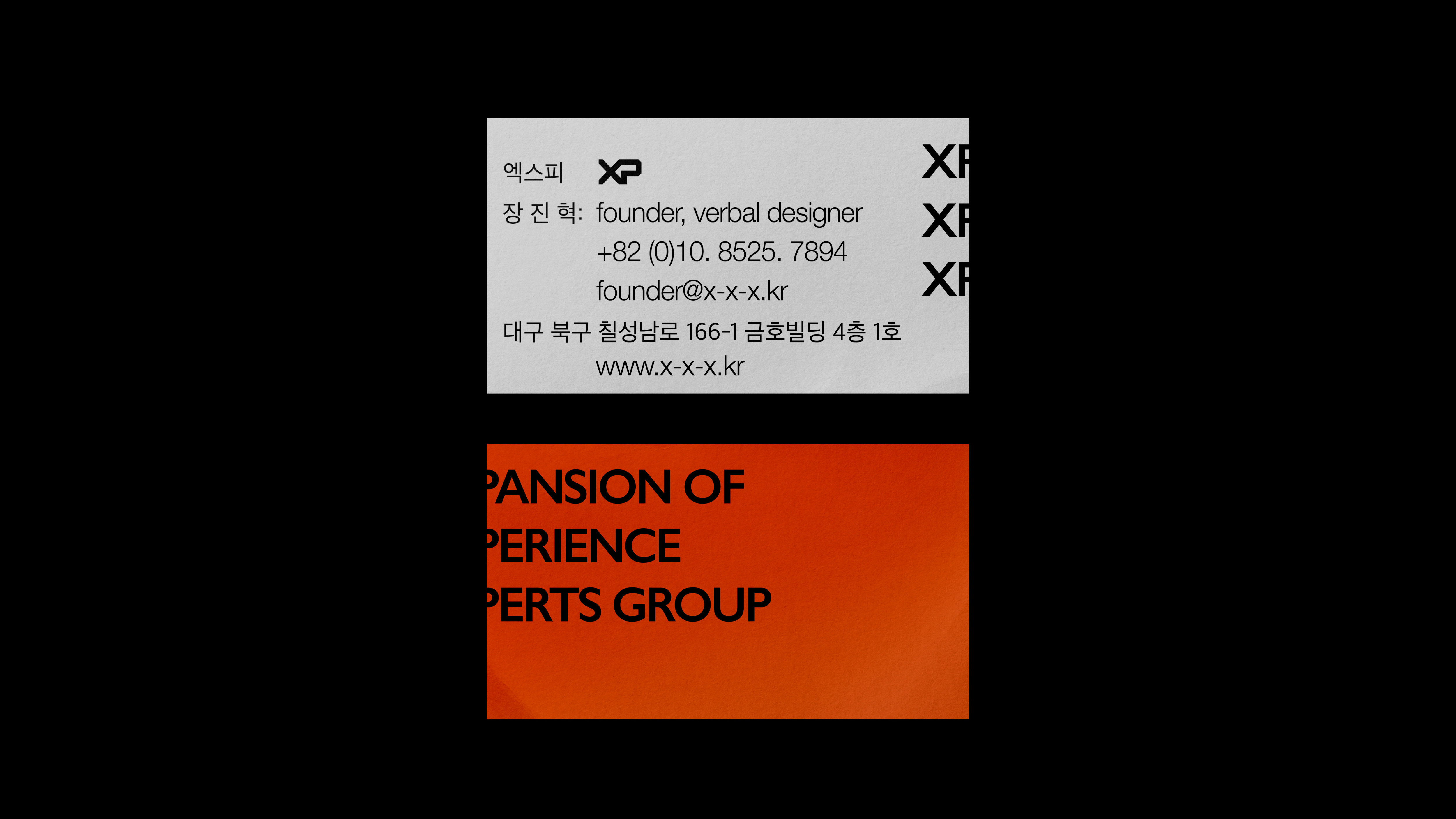
The Myrrors business card concept was designed for two reasons.
The first is the unkindness of escaping from the traditional form and not being conscious of others' eyes. It resembles the spirit of Myrrors, escaping from standardized trends in the age of deindividualization and finding their own taste.
The second is a meeting about the value of a business card. In fact, between 8 and 90 percent of business cards are either discarded or tucked away in unknown places and forgotten. Then, the design of the business card began with the question of whether it was necessary to make the information on the business card visible. After all, the person who needs the information will read it at the risk of inconvenience.
Rather than a well-organized text that is easy to read on palm-sized paper, it contains such irony that makes you want to read it more because it is difficult to read.
Myrrors 명함의 컨셉은 두가지의 이유로 디자인되었습니다.
첫번째는 전통적인 형태의 탈피와 타인의 시선을 의식하지 않는 불친절함 입니다. 그것은 몰개성화의 시대에 획일화된 트렌드에서 벗어나 자기만의 취향을 찾아가는 Myrrors의 정신과 닮아있습니다.
두번째는 명함이라는 물건으로서의 가치에 대한 회의입니다. 사실 명함의 8-90퍼센트는 버려지거나 어딘지 모를 공간에 박혀 잊혀집니다.그렇다면 굳이 명함의 정보가 잘 보이도록 만들어질 필요가 있을까 하는 의문에서 명함의 디자인이 시작되었습니다. 결국 정보가 필요한 사람은 불편함을 무릅쓰고라도 정보를 읽어낼 것이기 때문입니다.
손바닥만한 크기의 종이에 읽기 쉽게 잘 정돈된 텍스트보다 오히려 읽기 어려워서 더 읽어보고 싶어지는 그런 아이러니를 담았습니다.
MYRRORS Brand Identity and App UX/UI Development
2022
Client: Dogsear
Project Direction: Ben Shim
Verbal Identity & Story Dev.
Director: Ben Shim
Identity Planning & Storytelling: Ben Shim, Andrew Son
UX Writing: Dayoung Yoon
Visual Identity & Application Design Dev.
Art Direction: Andrew Son
BI System Design: Andrew Son
Motion Design: Andrew Son
BI Design Application: Andrew Son
UX/UI Design
Project Direction: Ben Shim, Andrew Son
Project Management: Andrew Son
Design: Andrew Son
Marketing: Ben Shim, Dayoung Yoon
www.myrrors.io